ZKTeco West Africa · 2020 – 2021
Making an enterprise attendance system usable by the people who actually run it
A dense, powerful workforce management product rebuilt around the daily rhythm of HR administrators — and the exception cases that consumed most of their week.
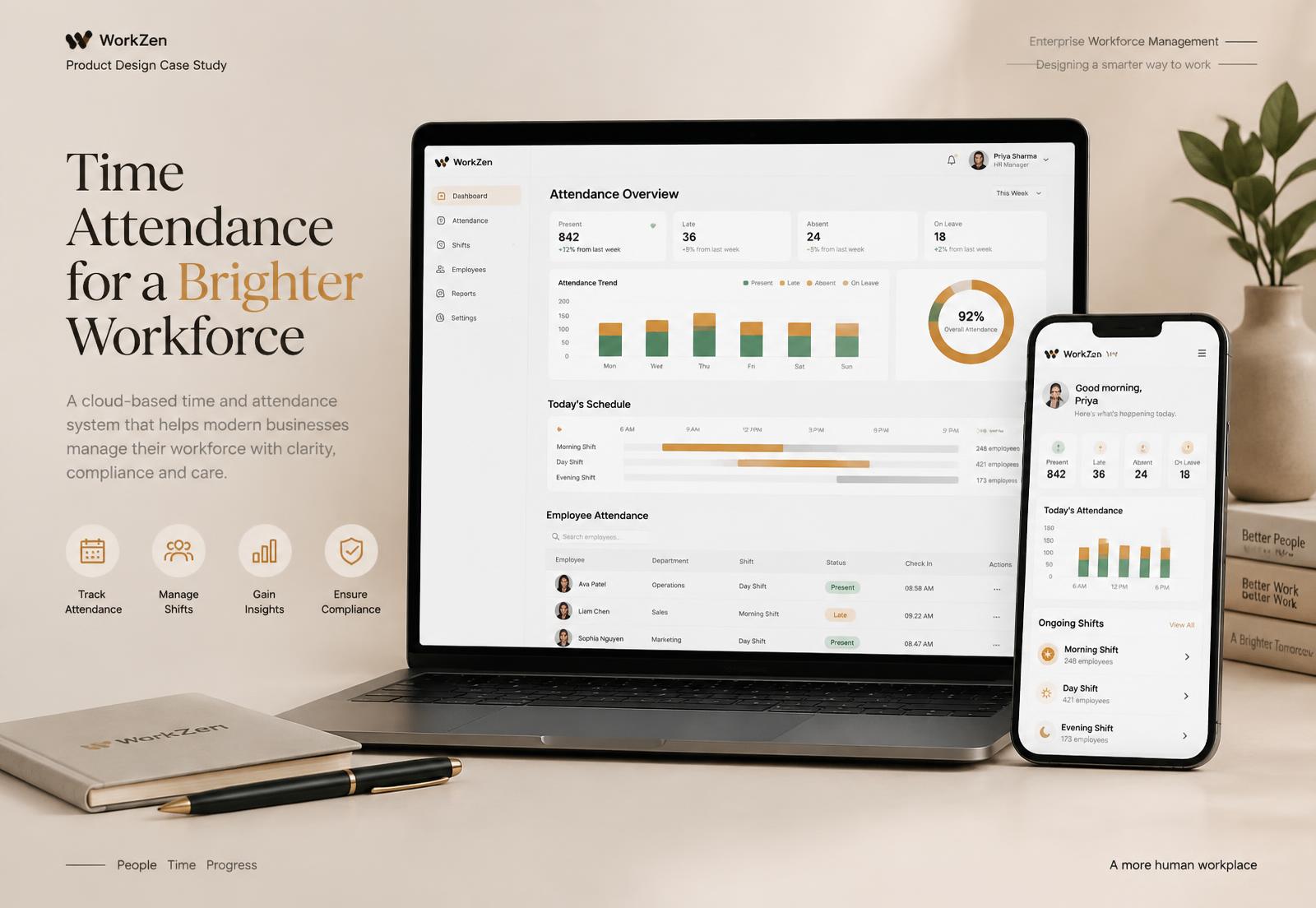
Role
Lead Product Designer — research, information architecture, interaction design, UI, design system
Team
2 designers (I led), 3 PMs, 10+ engineers across two locations
Timeline
About 8 months
Tools
Figma, Miro, Jira, Google Forms
Headline result
25% increase in user retention
What I did
- Ran on-site research with HR administrators across four customer organisations
- Restructured the information architecture around tasks rather than database entities
- Designed the exception-handling workflow that became the product's daily home
- Established the design system and led a second designer through it
Context
BioTime Cloud is the software layer on top of ZKTeco's biometric attendance hardware. It is bought by operations and finance leaders and used, every single day, by HR administrators who are not power users by choice.
Retention was the business problem: organisations renewed the hardware and quietly stopped using the software, falling back to exported spreadsheets. That is the most damning feedback an enterprise product can get — people preferred Excel to the thing they had paid for.
Research
I spent time on site with administrators at four customer organisations — a manufacturer, a hospital, a bank branch network and a logistics firm — watching a full attendance cycle rather than interviewing about it. Contextual observation mattered here because the workarounds were physical: sticky notes on monitors, a shared spreadsheet called FINAL_v7, a WhatsApp thread for shift swaps.
What I saw
- Nobody used the dashboard. It showed aggregate health; the job was individual exceptions.
- Roughly four fifths of the working day went to exceptions — missed punches, approved absences, shift swaps, device errors — and the product treated all of them as edge cases buried three levels deep.
- Month-end was a cliff. Payroll needed a clean file by a fixed date and the reconciliation work was entirely manual.
- The navigation mirrored the database: Devices, Employees, Departments, Shifts, Records. None of those are tasks.
“I export everything to Excel on the first of the month and I fix it there. It's faster than fighting the screens.”
The reframe
The product was built as a system of record. The users needed a system of resolution. Everything followed from that: if exceptions are the job, exceptions deserve the front door, and the aggregate dashboard everyone assumed was the home screen is actually a monthly reporting artefact.
Explorations
- 01
Restructure the dashboard
The safe option — better widgets on the existing home. Rejected: it improved a screen nobody's job depended on.
- 02
Exception queue as home
Open on today's unresolved items, grouped by type, resolvable inline with bulk actions for the repetitive ones. Radical for the stakeholders, obviously right from the observation notes.
- 03
Month-end mode
A dedicated reconciliation view that walks the administrator to a payroll-ready state, because the deadline is the moment the product either proves itself or gets replaced by a spreadsheet.
Selling the second option took the research, not the mockups. I brought the sticky-note photographs and the FINAL_v7 spreadsheet to the review. The room stopped arguing about the dashboard.
Design decisions, and why
The exception queue is the home screen; the dashboard moved to Reports.
WhyObservation showed where the day actually went. The home screen should be the job, not the summary of the job.
Exceptions resolve inline, with bulk actions on same-cause groups.
WhyA device outage generated sixty identical missed punches. Sixty individual resolutions is a data-entry task, not a decision.
Navigation is organised by task, not by entity.
WhyAdministrators think 'fix today's attendance' and 'close the month', never 'go to the Records table'.
Export stayed prominent instead of being designed out.
WhyRemoving the escape hatch would have broken trust with the exact users we needed back. Better to make the product good enough that export becomes a handoff, not a rescue.
Density stayed high, with typography doing the hierarchy work.
WhyThis is an expert tool used all day. Airy consumer spacing would have meant more scrolling and slower work.
The Figma layer
This was the project where I built the system properly, because two designers and ten engineers across two offices needed one source of truth.
- A foundation of colour, type and spacing tokens, then components built strictly on top of them — no loose values anywhere in the file.
- Data table, exception row and status components with full variant sets, including the states that always get forgotten: empty, loading, partial permission, device offline.
- Auto layout everywhere so tables could be stress-tested with long African name strings and multi-word department titles, rather than the short placeholder text that hides truncation bugs.
- A month-end prototype we ran with two real administrators end to end, using their own anonymised data.
Testing and iteration
Testing the month-end prototype exposed the biggest miss: bulk resolution had no audit trail, and every administrator we tested with stopped at the same point. In organisations where attendance drives pay, an unexplained bulk change is a liability. We added a required reason on bulk actions and a visible history per record. Slower by a few seconds, and the only version anyone would actually use.
Outcome
25%
increase in user retention
~80%
of the working day finally designed for
1 system
adopted across two product teams
Reflection
Going on site is what made this project work. Every insight that mattered came from watching a workaround, not from an interview answer — people describe the system as it is documented, then quietly do something else.
If I ran it again I would instrument the exception queue from day one. We proved retention improved; I still cannot tell you precisely which of the changes carried the most weight.