Woodsystem Technologies · 2019 – 2021
Turning a two-week configuration ordeal into a guided hour
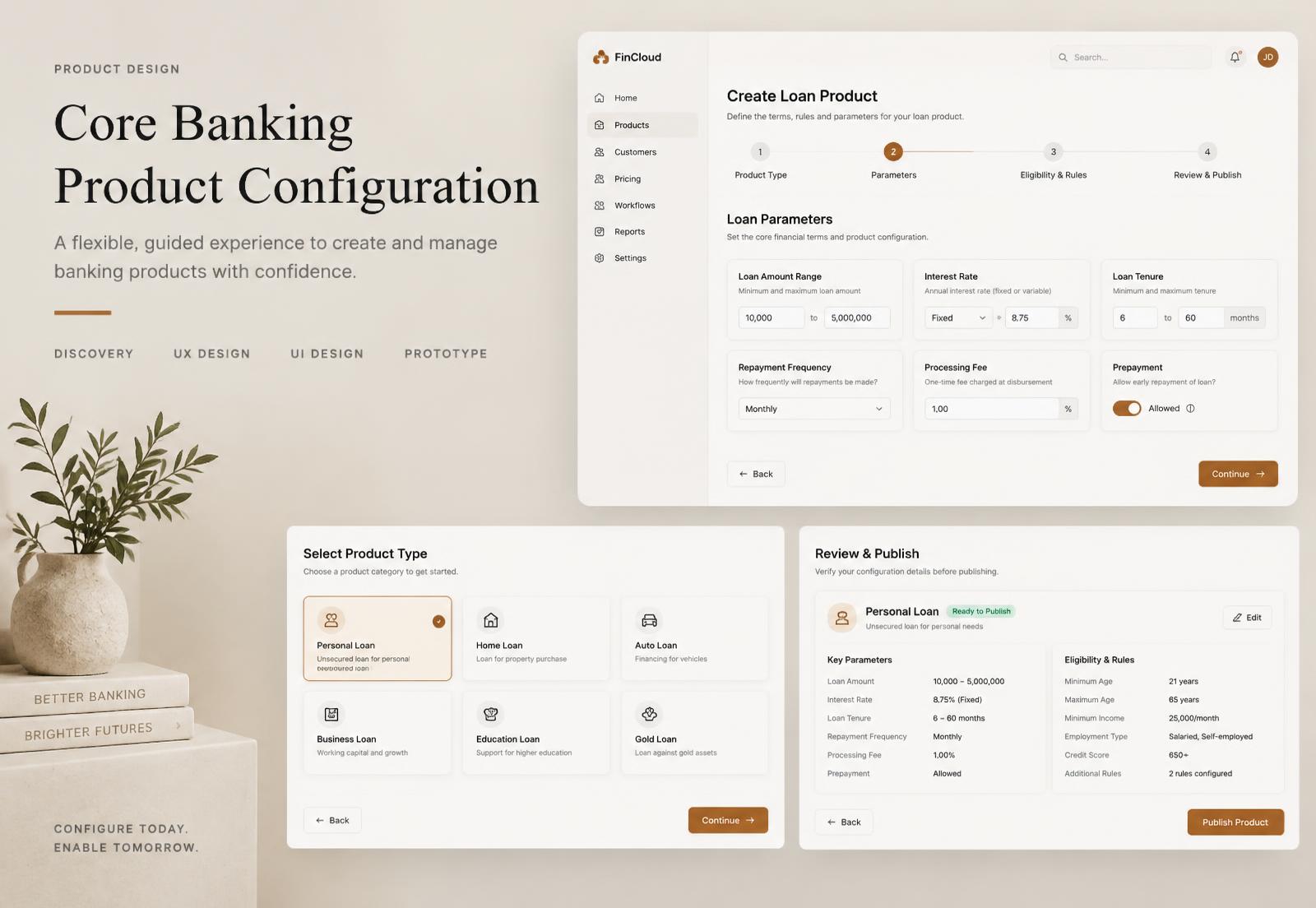
Product configuration for a core banking platform, redesigned so that defining a new financial product stopped requiring a vendor engineer and a spreadsheet of field definitions.
Role
Product Designer — research, interaction design, UI
Team
1 designer (me), 1 PM, 5 engineers, 2 banking domain experts
Timeline
About 6 months
Tools
Figma, Miro, Jira, Google Forms
Headline result
11% increase in user productivity
What I did
- Interviewed bank operations staff and implementation engineers
- Redesigned the product configuration module around progressive commitment
- Designed the validation and review model that removed the post-launch correction loop
- Documented patterns the wider platform adopted
Context
Woodcore is a core banking platform used by microfinance banks and lenders. Product configuration — defining a savings or loan product, with its rates, tenures, fees, eligibility rules and accounting mappings — is the module that decides whether a bank can move at market speed or not.
In practice, launching a new loan product took weeks and almost always involved a Woodsystem implementation engineer, because the configuration screen was effectively a rendered database form: dozens of fields, ordered by table, validated only on save, with terminology from the engine rather than from banking.
Research
I interviewed nine people across three banks plus our own implementation team, and — this was the useful part — asked each bank to show me the artefact they used to prepare a configuration. Every one of them had a spreadsheet. The spreadsheet was the real design brief.
What the spreadsheets revealed
- Configuration is a collaborative, multi-day drafting process, but the software treated it as a single-sitting form.
- Banks grouped fields the same way across all three institutions — commercial terms, eligibility, fees, accounting — and none of those groups matched the screen order.
- Approval was a real step: a product manager drafted, a head of operations signed off. The software had no concept of a draft.
- The most feared error was accounting mis-mapping, discovered weeks later in reconciliation.
“We build the product in Excel, then someone types it in. The typing is where the mistakes happen.”
The reframe
The screen was the last five per cent of a process it knew nothing about. Rather than making the form nicer, the job was to bring the whole drafting-and-approval process into the product: draft, collaborate, validate continuously, review as a human-readable summary, then publish.
Explorations
- 01
Grouped single page
Keep one page, group fields the way the spreadsheets did, validate live. Least disruptive; still overwhelming at first sight and still no draft concept.
- 02
Guided steps with a persistent summary
Four steps mirroring the banks' own grouping, with a live summary panel that reads back the product in plain banking language at every stage. This shipped.
- 03
Clone-and-adjust
Start from an existing product or a template rather than from nothing. Added as an entry point to the shipped flow — most new products are variations, not inventions.
Design decisions, and why
Four steps, grouped exactly as the banks' own spreadsheets were.
WhyThree independent institutions had converged on the same mental model. Designing against that would have been arrogance.
A live plain-language summary sits beside the form throughout.
WhyIt gives the approver something reviewable without reading field values, and it lets the drafter catch nonsense early — a 400% interest rate reads as absurd in a sentence and invisible in a number field.
Everything is a draft until explicitly published, with named approval.
WhyThe approval step already existed in the organisation; ignoring it pushed the work into email and spreadsheets.
Validation runs continuously, at the field and at the product level.
WhySave-time validation dumped a wall of errors after the effort was spent. Cross-field problems — a maximum below a minimum — need to surface when the second value is entered.
Accounting mapping got its own review gate with the mapping shown explicitly.
WhyIt was the highest-cost error in the system and the one discovered latest. Friction is correct where the consequence is a reconciliation crisis.
Every label uses banking language, not engine terminology.
WhyThe vocabulary gap was the reason a vendor engineer had to be in the room at all.
The Figma layer
- Field components with variants for state — default, focused, error, warning, disabled by dependency — so validation behaviour was specified rather than described in a comment.
- Auto layout on the summary panel, which grows unpredictably as a product gains rules; designed at both the sparsest and densest realistic case.
- A clickable prototype of the full four-step flow, including the error paths, which we walked through with two banking domain experts before a line of it was built.
Testing and iteration
We tested with five bank staff using a real product definition from their own portfolio. The steps worked. The step indicator did not — participants assumed it was strictly linear and would not jump back to change a rate they had noticed was wrong, which is precisely the behaviour the summary panel was meant to enable. Making each completed step directly clickable, and making every line of the summary a link to its field, closed the gap.
Outcome
11%
increase in user productivity
Weeks → hours
for a typical new product launch
Self-serve
configuration without a vendor engineer
Reflection
Asking to see the artefact people already use is the highest-yield research question I know. The spreadsheet gave me the grouping, the process and the approval model in one afternoon.
I under-designed the collaborative side. Drafts were shared, but commenting and change history came later, and both were requested almost immediately.